
A Run Chart represents the data of the process in time. We use this type of running graph to look for evidence of variation for special causes in your process.
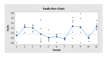
Example of a Run Chart
A manufacturing engineer wants to evaluate the production process of a new product made of plastic. The engineer takes 5 samples of the product every hour for 20 hours to test the resistance of the plastic and generates this Run Chart.
With the exception of one observation, the points vary randomly around the center line (median). The approximate values of “p” for the conglomerates, the mixtures, the tendencies and the oscillation are greater than the level of significance of 0.05. Therefore, there is no indication of variation due to special causes or non-randomness.
What do the points and the center line mean in a Run Chart?
A run chart represents the individual observations in the order in which they were collected. The gray points represent the individual values. The blue dots represent the means of the subgroup or the means of the subgroup.
The horizontal center line is drawn depending on which option you chose in the Run Chart dialog box. (To open the Run Chart dialog box, choose Statistics> Quality Tools> Run Chart.) If you select:
Chart subgroup means, the center line is the median of all the subgroup means and the blue points on the chart are the subgroup means.
Chart subgroup medians, the center line is the median of all the medians of the subgroup and the blue points on the chart are the medians of the subgroup.
If the size of the subgroup is = 1, the center line is the median of all the data, regardless of the option you select for the plotted points.
Even with asymmetric data, the median of the subgroup means is usually close to the median of the subgroup median. The y-axis has a wide range because the raw data is also plotted, therefore, the difference is usually not noticeable.
Run charts help detect variation due to special causes
Variation occurs in all processes. The variation of common cause is a natural part of the process. Variation due to special causes originates outside the system and produces patterns, changes or trends that can be identified in the data. The run graph shows graphically if special causes are affecting its process.
Run charts also provide tests to determine randomness, which provide information about the non-random variation caused by trends, oscillations, mixtures and clusters in the data. These patterns indicate that the variation observed is caused by special causes.
Non-random patterns that can identify a running graph
There are four basic patterns of non-randomness that can be detected by a run chart.
1. Mix patterns
A mixture is characterized by frequently crossing the center line. Often, mixtures indicate combined data from two populations or from two processes operating at different levels. If the value of “p” for mixtures is less than 0.05, you can have mixtures in your data.
If the value of “p” for mixtures is less than 0.05, you can have mixtures in your data. In this chart, the mix can indicate that the data originates in different processes.
2. Conglomerate patterns
Conglomerates may indicate variation for special causes, such as measurement problems, batch to batch variability or configuration or sampling of a group of defective parts. Conglomerates are groups of points in an area of the chart.
If the “p” value for the conglomerates is less than 0.05, you can have conglomerates in your data. In this case, the data enclosed in a circle can represent clusters of data.
3. Swing patterns
Oscillation occurs when data fluctuates up and down, indicating that the process is not stable.
If the “p” value for the conglomerates is less than 0.05, you can have conglomerates in your data. In this case, the data enclosed in a circle can represent clusters of data.
4. Trends patterns
A trend is a gradual change in the data, either up or down. A trend may notice that a process is out of control or is likely to get out of control and may be due to factors such as tools worn, a machine that does not maintain the configuration values or periods of rotation of the operators.
If the “p” for trends is less than 0.05, you may have a tendency in your data. In this case, the upward trend is enclosed in a circle, which makes it clearly visible.
5. What are the disadvantages of using a Run Chart?
A Run Chart includes statistical data about a company and determines if it is in a state of statistical control. If it is found to be in control, a chart will allow making future predictions, if not, it can be used to locate sources of variation that may have contributed to this loss of control.
A Run Chart is completely dependent on the amount of information that is included in it. It will not be useful to identify a problem if it has not been carefully monitored, and unexpected events cannot be anticipated. In addition, a Run Chart can identify a source of imprecise variation, but it does not indicate which subgroup within a larger designation is actually responsible for a loss of control.
Because a Run Chart reduces everything to a statistical analysis, it cannot account for many complex variations that are present in companies, such as seasonal and multivariate data. The chart is quite rigid in this sense and has a certain form that is difficult to adapt to less conventional business models. Efforts have been made to adapt the Run Chart to more common situations, but this cannot account for all the scenarios of a business.
Run Charts use only the most recent data in order to determine whether a company is in control or not. Abnormal variations to standard deviations of 1.5 or less, therefore, are not easily counted. A Cumulative Sum Run Chart calculates the cumulative sum of the measurement deviations of a mean in order to take these abnormal variations into account, but does not completely solve the problem. Using only recent data does not allow us to account for the long-term processes of a growing business.
The Run Chart is designed to be used as a scanning tool. The proper use of this assumes that all the factors have been taken into account and incorporated. In addition, you must know what you are looking for when observing the results of a Run Chart. Therefore, this is more useful in identifying the sources of variation for a known problem. Due to its structure, it is easy for different data to slide into the graphic and for it to be used incorrectly.