
Identifying Production Value & Waste
From flow charts to process maps and resource schedules, there are plenty of methods for planning and tracking business processes, assigning resources, and tracking the availability of resources. Among these daily operations, there are bound to be imperfections and errors, however, that lead to waste of time, resources, materials, and more. It is important to identify these leaks in processes in order to minimize waste or eliminate it where possible.
Identifying Value & Waste
The identification of where value is being added to a process and where waste occurs is where value stream mapping comes in. Value stream mapping involves taking a more detailed look at processes to identify where processes are effective and where production gets bogged down. The practice of value stream mapping assists businesses in closing gaps in production such as idle time (materials sitting around waiting for the next phase) and delays due to errors (such as defects).
High-Level Process Mapping
To get an understanding of value stream mapping, we will start a level above at a value stream map–a high-level process map. In a process map, processes are outlined, raw materials are listed as inputs, resources–such as people and machines–are listed as operators responsible for processing those materials in each phase, and products are listed as outputs.
Following is an example of a high-level process map showing manufacturing processes for our example business, a manufacturer of organic bedding. It shows a high-level view of the process of creating bedding from the input of raw materials (fibers, such as cotton, polyester, etc.) to the output of the end product (organic bedding). For simplicity, we exclude the packaging process.
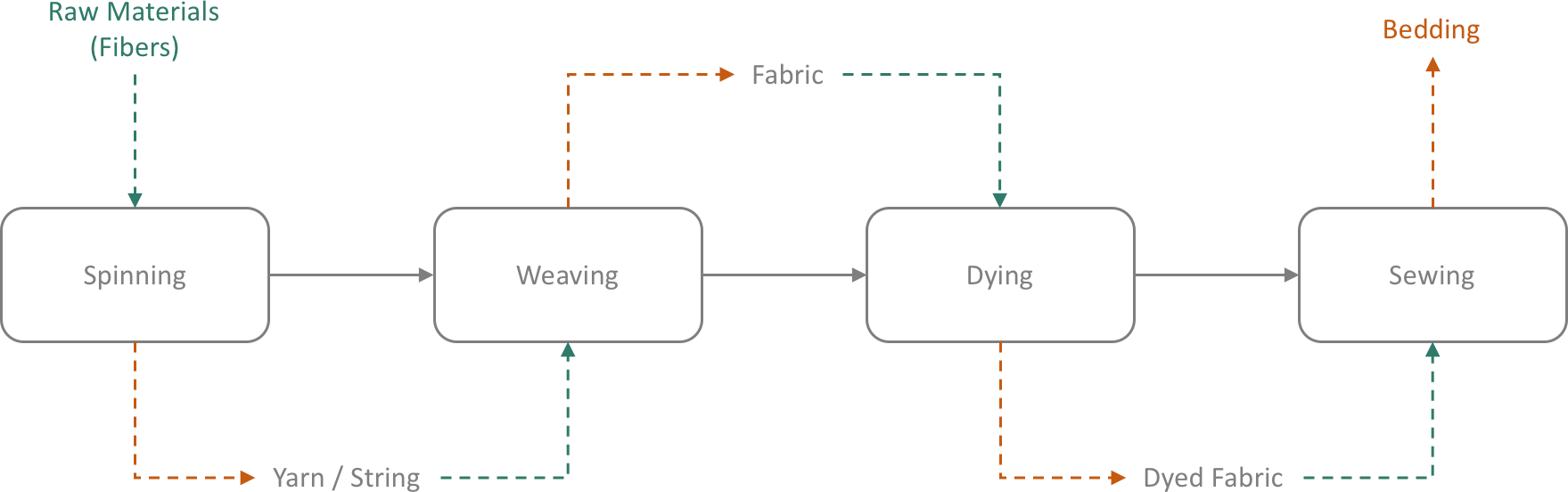
As you can see, this gives the viewer a great bird’s-eye view of the manufacturing process. But what it does not do is show the viewer what happens to each input within each phase. For example, what specifically happens to the fibers within the spinning process? What processes does the yarn go through in order to be turned into fabric? And so on and so forth.
To answer the previously-asked questions, we must go a level deeper than high-level process charts and break each phase down into its individual sub-processes. This will allow an analyzer to see how much time and resources are used and how they are used within each step of the process.
Value Stream Mapping
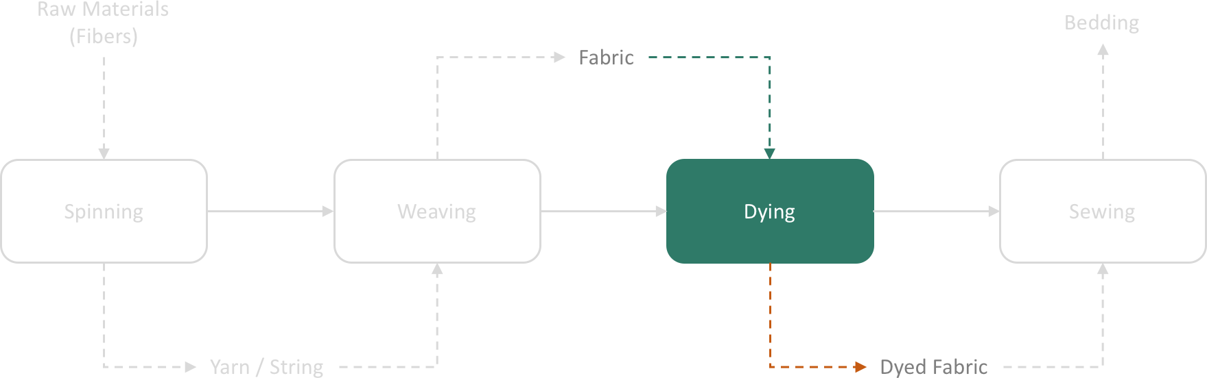
For our example, we will zoom in on one of the phases from the process map above to obtain greater detail on that phase. Let’s take a look at the third phase, dying, and find out where value is being added in the process of turning fresh fabric (greige) into crisp, colored fabric and where it is not:
In this value stream map, we go from high-level–level 1 with summary detail–to detail level–level 2 with added detail.
Within the fabric-dying process, there are sub-processes. Each sub process is assigned to a team responsible for that process. When the fresh fabric comes to the dying department, it is not crisp and evenly-colored like sheets on a shelf; it is unevenly colored and discolored. Fabric in this raw state is called greige. In order to obtain the crisp, even texture and color of store-bought sheets, it must first be cleansed and color must be removed by way of washing with organic, natural detergents and liquids. Once washed and decolored, it moves to the first drying phase. Then, it moves to the dying phase. Lastly, it moves to final drying and ironing phase before it moves on to sewing. These processes are laid out below:
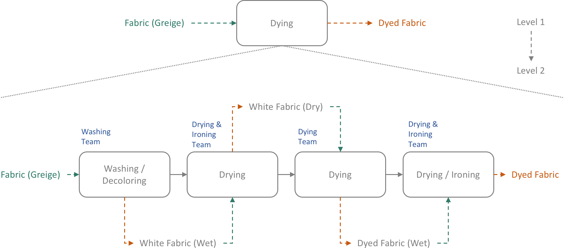
Notice that each phase has the team responsible for completing that phase in blue. Each phase shows its output as well. For example, the dying team outputs wet, dyed fabric that is then passed on to the team responsible for drying and ironing.
But we still need more detail in order to gain information on where value is being added and where waste exists. Value is defined as any part of the process that directly moves the product toward becoming a finished product–something a customer will pay for. Waste is defined as anything that is not moving the product toward becoming a finished product, such as fabric sitting idle and not being processed. To display value and waste, the above graph will be arranged into “swim lanes” where each team’s responsibilities are arranged into linear lanes and average times for phases and time in between phases are added:
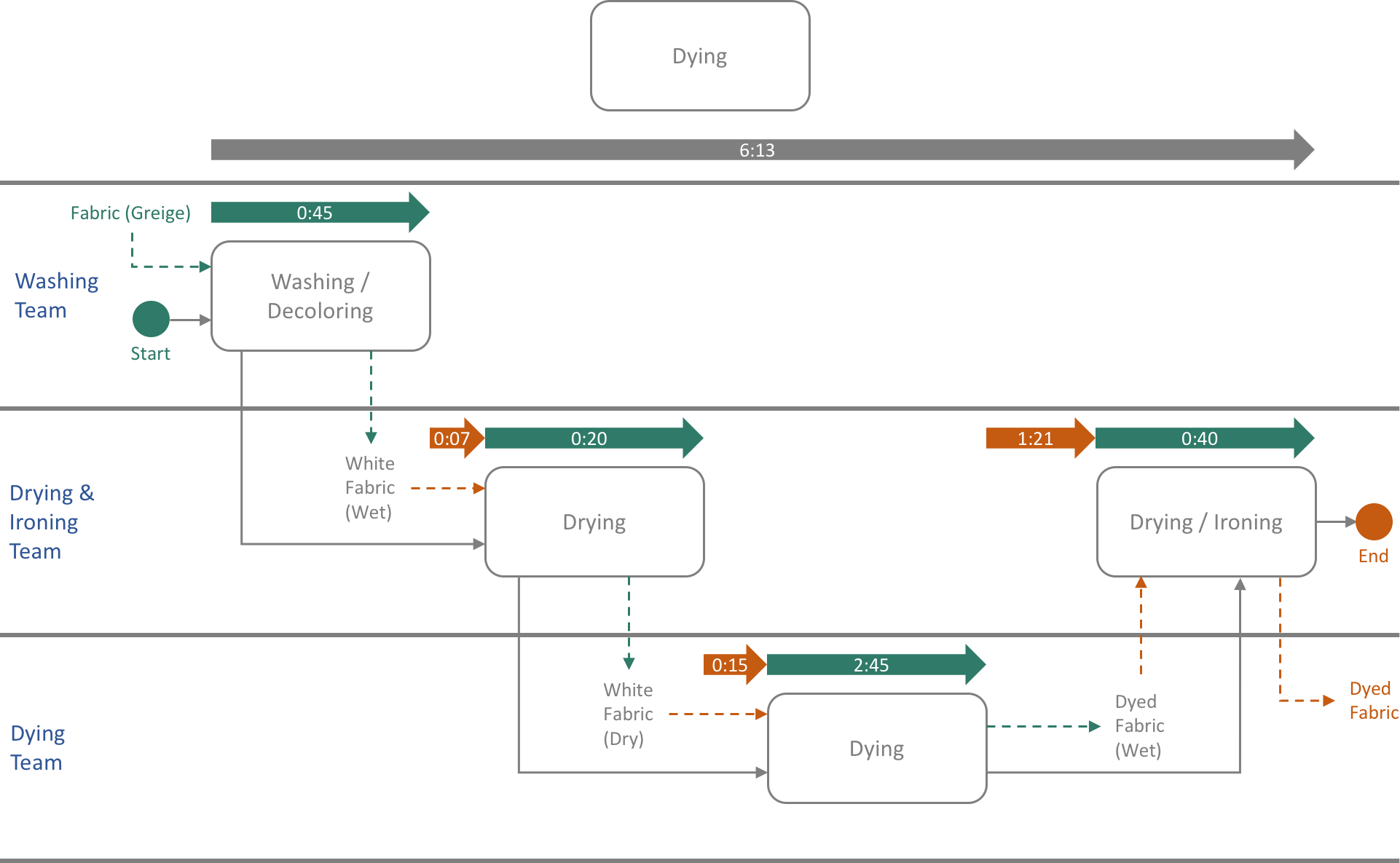
The gray arrow at the top displays the entire time taken for the dying process, six hours and thirteen minutes. The colored arrows below display time where value is added and waste. The green arrows show where value is being added. The orange arrows show delays and lag time–where there is waste.
The delays in between phases 1, 2, and 3 could possibly be shortened or eliminated. However, the obvious large problem lies in between the dying process and the final drying and ironing process. We can see that a full hour and 21 minutes passes on average between the time that a set of bedding is dyed and the drying and ironing team gets to it. Upon analysis, it could be discovered that this is due to slow staff, broken or inefficient drying or ironing equipment, poor communication, or any number of reasons.
In Closing
There are a host of additional details and useful icons that are commonly added to these diagrams. However, this thorough overview should provide you with a firm grasp on the purpose of value stream mapping and how it helps close waste gaps in production.