
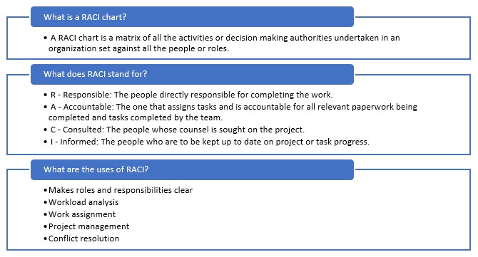
The RACI chart (or Cairo or RASCI chart, among other names; they’re largely interchangeable) is a powerful tool for improving team organization and cohesion. People are inherently flawed and forgetful (and sometimes lazy), and charts like this help diminish the effects of these traits. The chart makes sure everybody knows their roles and responsibilities and everybody else’ roles and responsibilities at the same time. This reduces redundancy and things “slipping through cracks” because there is an easy to read chart for who needs to be doing what and what role they serve in a group, written in a very simple format:
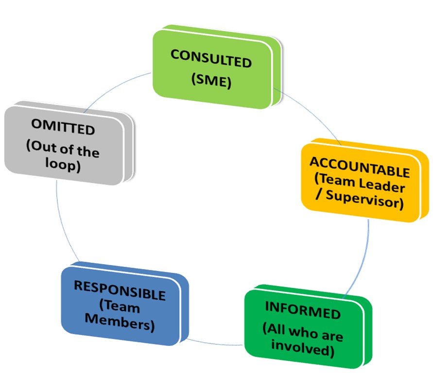
R – Responsible; The people directly responsible for completing the work. Usually individual team members.
A – Accountable; The one that assigns tasks and is accountable for all relevant paperwork being completed and tasks completed by the team. Usually a team lead or supervisor.
C – Consulted; People whose counsel is sought on the project. Usually some kind of expert on some subject or another.
I – Informed; People kept up to date on project or task progress. Can (and usually should) be everyone involved, except for certain top-level developments not necessarily relevant to those below the supervisor.
This chart comes out very clean, divided by role and project, and can be used at first as reference for improving processes (by for example reassigning Responsibility to other members who have less to do when it has naturally accumulated on one person) or just as a general reference of who does what, as illustrated below.
| Team Lead | Team Member | Product Owner | Stakeholder | |
| Task A | A/I | R/I | I/C | I |
| Task B | A/I | R/I | I/C | I |
| Task C | A/I | I/C | I | |
| Task D | A/I | R/I | I |
The format may differ slightly between companies, and the complexity will naturally increase the more team members, projects, and varied roles are added (for example a larger team might have multiple team leads, each with different tasks they are Accountable for and Informed about), but the general structure will always be the same.
As I said, this is a powerful organizational tool, and is a great and easy to set up chart for responsibilities (in my experience it is often simply drawn on a whiteboard and edited as necessary). However, that is all it is: An informational and organizational tool. I unfortunately too often see people try to use it as a method for assigning blame and credit rather than responsibility.
Quite frankly, this is bad leadership and leads to a toxic team environment. It kills all the benefit of the chart. Existing on its own it helps impart a sense of ownership in the project, and perhaps most importantly helps with team members lowering their frustration levels.
Think how often you’ve worked in a team and everybody collectively forgot a task needed to be done and had to scramble at the last minute, the refrain usually being “I thought James was supposed to be doing that!” or “We agreed Sarah needed to get that done by Friday!”, but Sarah was already overloaded with responsibilities (due to being the most experienced with a certain system, or simply never speaking up or not noticing she had too much on her plate until it was too late).
A RACI chart significantly curtails those scenarios. The group does not collectively think one person was supposed to do something; it was on the chart. And if someone is overworked, it’s clearly visible.
Turning it into a system for determining punishment and reward negates those advantages, because now people start jockeying for position. Perhaps not speaking up as a group when someone is assigned too much Responsibility in order to sabotage them, or purposefully taking on more work than they can reasonably handle in order to look good.
More commonly, people simply choose not to Inform someone of something they needed to be abreast of, and point the finger that they were absolutely informed and just dropped the ball (less common with automatic mailing lists, but I’ve still seen it happen, or at least attempted). That kind of toxic workplace is a hostile and demotivating place to work, and more importantly it is simply inefficient. Competition is not inherently bad, but this kind of competition most certainly is, and management twisting the chart’s purpose that way is simply bad management.