
The Seven Basic Tools of Quality (also known as 7 QC Tools) originated in Japan when the country was undergoing major quality revolution and had become a mandatory topic as part of Japanese’s industrial training program. These tools which comprised of simple graphical and statistical techniques were helpful in solving critical quality related issues. These tools were often referred as Seven Basics Tools of Quality because these tools could be implemented by any person with very basic training in statistics and were simple to apply to solve quality-related complex issues.
7 QC tools can be applied across any industry starting from product development phase till delivery. 7QC tools even today owns the same popularity and is extensively used in various phases of Six Sigma (DMAIC or DMADV), in continuous improvement process (PDCA cycle) and Lean management (removing wastes from process).
The seven QC tools are:
- Stratification (Divide and Conquer)
- Histogram
- Check Sheet (Tally Sheet)
- Cause-and-effect diagram (“fishbone” or Ishikawa diagram)
- Pareto chart (80/20 Rule)
- Scatter diagram (Shewhart Chart)
- Control chart
1. Stratification (Divide and Conquer)
Stratification is a method of dividing data into sub–categories and classify data based on group, division, class or levels that helps in deriving meaningful information to understand an existing problem.
The very purpose of Stratification is to divide the data and conquer the meaning full Information to solve a problem.
- Un–stratified data (An employee reached late to office on following dates)
5-Jan, 12-Jan,13-Jan, 19-Jan, 21-Jan, 26-Jan,27-Jan
- Stratified data: (Same data classified by day of the week )
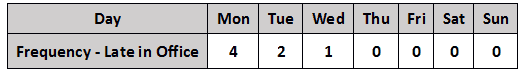
Table 1.1
(Frequency – Late in office day wise)
2. Histogram
Histogram introduced by Karl Pearson is a bar graph representing the frequency distribution on each bars.
The very purpose of Histogram is to study the density of data in any given distribution and understand the factors or data that repeat more often.
Histogram helps in prioritizing factors and identify which are the areas that needs utmost attention immediately.
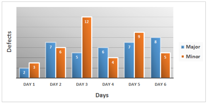
Chart 2.1
(Histogram: Defects day wise)
3. Check sheet (Tally Sheet)
A check sheet can be metrics, structured table or form for collecting data and analysing them. When the information collected is quantitative in nature, the check sheet can also be called as tally sheet.
The very purpose of checklist is to list down the important checkpoints or events in a tabular/metrics format and keep on updating or marking the status on their occurrence which helps in understanding the progress, defect patterns and even causes for defects.
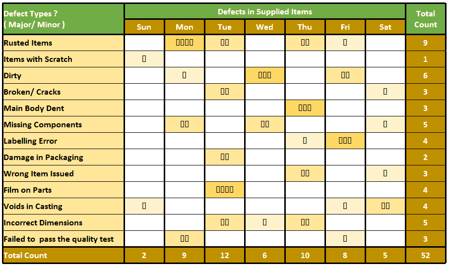
Table 3.1
(Check Sheet: Defect types with their occurrence on day of the week)
4. Cause-and-effect diagram. (“Fishbone” or Ishikawa diagram)
Cause–and–effect diagram introduced by Kaoru Ishikawa helps in identifying the various causes (or factors) leading to an effect (or problem) and also helps in deriving meaningful relationship between them.
The very purpose of this diagram is to identify all root causes behind a problem.
Once a quality related problem is defined, the factors leading to the causal of the problem are identified. We further keep identifying the sub factors leading to the causal of identified factors till we are able to identify the root cause of the problem. As a result we get a diagram with branches and sub branches of causal factors resembling to a fish bone diagram.
In manufacturing industry, to identify the source of variation the causes are usually grouped into below major categories:
- People
- Methods
- Machines
- Material
- Measurements
- Environment
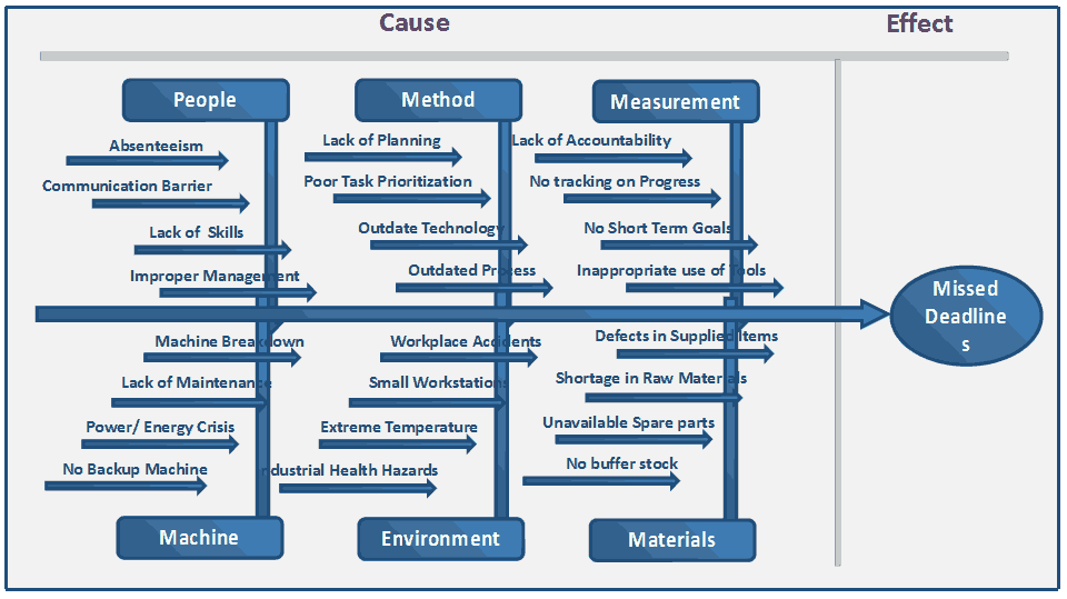
Figure 4.1
(Fishbone Diagram: Missed deadline in manufacturing of product)
5. Pareto chart (80 – 20 Rule)
Pareto chart is named after Vilfredo Pareto. Pareto chart revolves around the concept of 80-20 rule which underlines that in any process, 80% of problem or failure is just caused by 20% of few major factors which are often referred as Vital Few, whereas remaining 20% of problem or failure is caused by 80% of many minor factors which are also referred as Trivial Many.
The very purpose of Pareto Chart is to highlight the most important factors that is the reason for major cause of problem or failure.
Pareto chart is having bars graphs and line graphs where individual factors are represented by a bar graph in descending order of their impact and the cumulative total is shown by a line graph.
Pareto charts help experts in following ways:
- Distinguish between vital few and trivial many.
- Displays relative importance of causes of a problem.
- Helps to focus on causes that will have the greatest impact when solved.
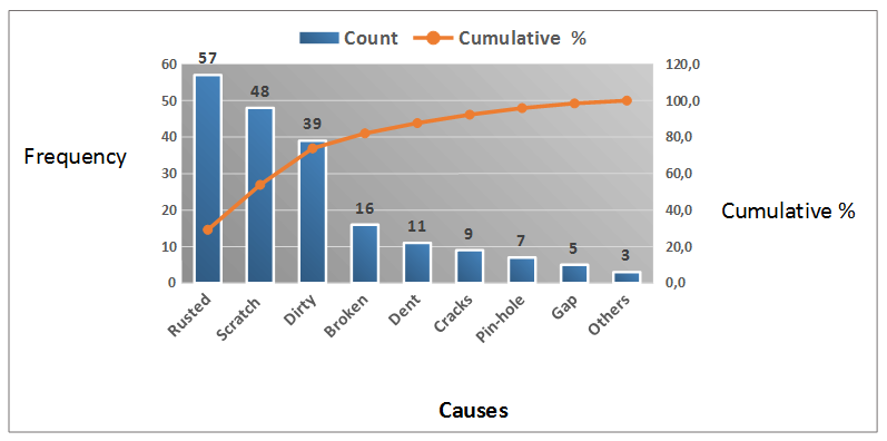
Chart 5.1
(Pareto Chart: Causes for defects in supplied items)
6. Scatter diagram
Scatter diagram or scatter plot is basically a statistical tool that depicts dependent variables on Y – Axis and Independent Variable on X – axis plotted as dots on their common intersection points. Joining these dots can highlight any existing relationship among these variables or an equation in format Y = F(X) + C, where is C is an arbitrary constant.
Very purpose of scatter Diagram is to establish a relationship between problem (overall effect) and causes that are affecting.
The relationship can be linear, curvilinear, exponential, logarithmic, quadratic, polynomial etc. Stronger the correlation, stronger the relationship will hold true. The variables can be positively or negatively related defined by the slope of equation derived from the scatter diagram.
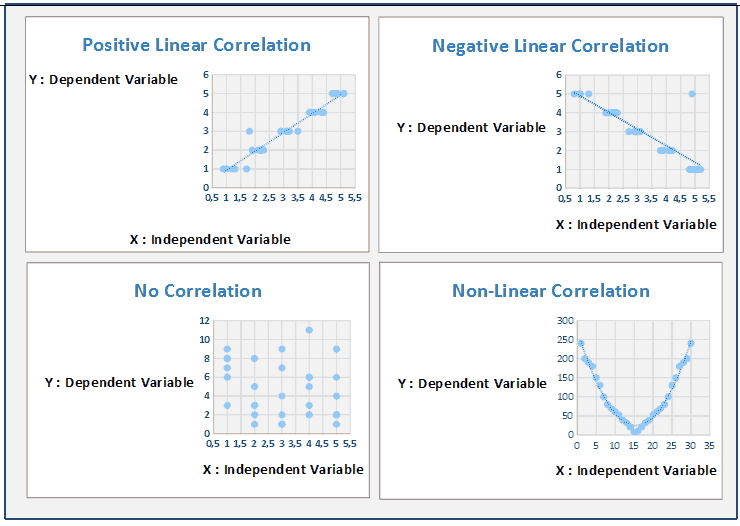
Figure 6.1
(Scatter Diagram: Types of correlation in Scatter Plot)
7. Control Chart (Shewhart Chart)
Control chart is also called as Shewhart Chart named after Walter A. Shewhart is basically a statistical chart which helps in determining if an industrial process is within control and capable to meet the customer defined specification limits.
The very purpose of control chart is to determine if the process is stable and capable within current conditions.
In Control Chart, data are plotted against time in X-axis. Control chart will always have a central line (average or mean), an upper line for the upper control limit and a lower line for the lower control limit. These lines are determined from historical data.
By comparing current data to these lines, experts can draw conclusions about whether the process variation is consistent (in control, affected by common causes of variation) or is unpredictable (out of control, affected by special causes of variation). It helps in differentiating common causes from special cause of variation.
Control charts are very popular and vastly used in Quality Control Techniques, Six Sigma (Control Phase) and also plays an important role in defining process capability and variations in productions. This tool also helps in identifying how well any manufacturing process is in line with respect to customer’s expectation.
Control chart helps in predicting process performance, understand the various production patterns and study how a process changes or shifts from normally specified control limits over a period of time.
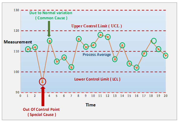
Figure 7.1
(Process Control Chart)