
Measuring Processes for Stability and Ability to Meet Requirements
As business processes are put into place and after they are in place, continued evaluation is recommended to determine the effectiveness of those processes. It is one thing to test in theory, but another to put processes “through the ringer” and see how well they do in real life once executed. Two primary factors to test are stability and capability, and stability process control helps us do so.
Stability Process Control
Stability process control is a LEAN Six Sigma process for verifying whether or not a process is effective in the two primary areas mentioned prior–stability and capability. Let’s dig into the details of what these terms imply:
Stability refers to whether or not a process is consistent–consistently producing the same and expected results, the same and expected quality, and even the same and expected margin of error. Every process has some level of error, and if a company expects the normal amount of error, they can prepare additional processes to correct standard error such as the need to rework defective parts, scrap imperfect units and recycle materials, etc. Error correction also contributes to the stability of a process.
Capability refers to the ability of a process and its standard output to meet customer requirements, specifications, and demand. A company aims for certain target value of production, and (typically) the further it moves away from its target value, the higher the cost to the organization and sometimes to society. This is truer the closer a company’s target value is to what customers actually want.
To determine stability and capability, LEAN Six Sigma uses stability control charts (SPC) or histograms, which we will also cover shortly.
Stability Process Control Charts: Stability
To determine stability, LEAN Six Sigma puts to use stability process control (SPC) charts, or X Charts. These charts are essentially a histogram in the form of a line chart that shows variations in production–both standard variation and unusual or extreme variation. For more on types of variation, we suggest reading the article on common cause variation.
An SPC Chart (or x-chart) is a line chart (or histogram) that displays recorded data at different points in time. Let’s look at an example.
Our example company is a small bakery. The bakery sells fresh baked goods over the counter that are baked when ordered. When a customer places an order, pre-combined batter ingredient mixes are prepared and mixed for the number and quantity of goods ordered and placed in the oven. Each item, from mixing to leaving the oven, has a standard (or average) preparation time:
Crescent Roll: 12 Minutes
Bread Sticks with Marinara: 13.5Minutes
Bread Loaf: 14 Minutes
Pot Pie: 16 Minutes
In the below chart, the average production time of crescent rolls per hour is recorded over the course of one business day, 6:00 AM to 7:00 PM. The left axis shows the scale relevant to the recorded data. In this case, it shows minutes from zero minutes to 24 minutes. The bottom axis shows different points in time. In this case, it shows each hour of the business day–from the hour of 6:00 AM to the hour of 6:00 PM (no data is shown for the hour of 7:00 PM because the doors close at 7:00 PM). Take a look at the chart, then we will explore how to read the details:
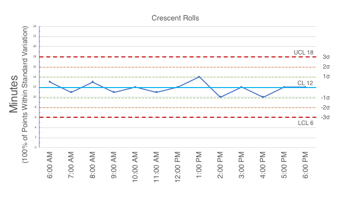
Control Limit (CL): The Control Limit is the target value and is represented by the thick blue line in the middle of the chart. In this example, the control limit is the ideal preparation time. Given our list of standard preparation times above, the control limit for the preparation of a crescent roll is 12 minutes. Therefore, the control limit axis lies at 12 minutes.
Upper Control Limit (UCL): The Upper Control Limit is essentially the furthest above the standard control limit that preparation time should rise before a company should investigate the issue. If preparation is taking much longer than it should, you will see a steady upward slope in the line toward the upper control limit or a spike upward.
Lower Control Limit (LCL): Similar to the upper control limit, the Lower Control Limit is essentially the furthest below the standard control limit that preparation time should fall before a company should investigate the issue. If preparation is taking much shorter than normal, this could be a good thing, but might still represent an issue. In this case, you will see a steady downward slope in the line toward the lower control limit or a downward spike.
The variation in the line in our first chart above is standard (a normal day) with preparation time for crescent rolls varying between 10 and 14 minutes–very close to the standard of 12. This is Common Cause Variation. All, or nearly all, data points throughout the day should fall within the green lines, which represent 1 sigma. If variation rises above or falls below 1 sigma to 1, 2, or 3 sigma or further, this is a red flag that there is an issue. This would be Special Cause Variation and should be investigated.
The second example below shows another day where variation in preparation takes a spike during the hours of 12:00 to 2:00 PM. See the red segments of the line below:
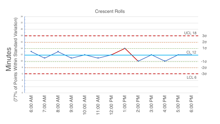
As you can see, common cause variation takes place for much of the day, but these three hours show that preparation time was far longer than the average 12 minutes–rising to 17, 18.5, and 22 minutes. This creates a red flag, triggering investigation, in which case the company discovers that an over had a short in the electrical connection to the heating elements, cause the element to heat sometimes, and other times fail.
In Closing
These charts can be created for many different processes and products. They can be used for recording data about physical product outcomes, time, sales, even people and reactions. They play an important role in monitoring and knowing how to adjust company practices.