Correlation as the word indicates means inter-relationship and in statistical term is used to signify the extent of relationship between two variables and therefore, Correlation measures the Strength of relationship between two variables.
There are two types of correlation: Positive Correlation, Negative Correlation (or) No Correlation.
Positive Correlation: When there is a strong relationship between two different variables such that both behave similarly and are dependent variables, and show a positive linear relationship.
Let’s discuss this with an example to understand it better. We have learnt in school that as Temperature increases, Pressure also increases.
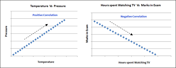
If we plot the data points in a two-dimensional graph, we can observe that if we plot a linear line through the data points it will look somewhat like the graph displayed in the below Figure (a). Here, both the variables move in the same direction. Therefore, it is called a Positive Correlation.
Negative Correlation: When there is a relationship between two variables such that an increase in one variable results in a decrease in its dependent variable, it indicates a negative correlation.
For example, when hours of time spent watching Television by a student increases, his marks in examination decreases.
In this example, as hours of time spent watching TV increases, the student’s marks decreases. So, both the variables move in opposite direction. Therefore it is called as Negative Correlation. This is depicted in the below Figure (b).
The above graph is called a Scatter Plot. For each value in X axis, there will be a paired value in Y axis.
A Scatter Plot cannot be drawn without paired data values.
In Figure (a), the graph represents the Correlation between Temperature and Pressure. The line moving upwards indicates Positive Correlation. The second graph [Figure (b)], represents the Correlation between ‘Hours spent watching TV’ and ‘Marks in Exam’. The line moving downwards indicates negative Correlation.
There is another aspect we need to investigate in order to understand the concept of Correlation completely – it is the Strength of Correlation.
When two variables are correlated, how to predict the strength of the Correlation? Are they highly correlated?, or are they weakly correlated?, or is there NO Correlation between these two variables?
The Strength of Correlation is calculated using the below Formula.
r : Correlation coefficient
n: Number of data sets
xi :ith Value of variable x
yi :ith value of variable y
The ‘r’ value is also called as Pearson’s Correlation coefficient.
Note: One of the pre-requisites for using this Pearson’s Correlation coefficient is that both the variables should be in Continuous Scale.
Another pre-requisite is that Pearson’s Correlation coefficient applies only for linear relationships.
Mathematically, the value of Coefficient of Correlation can range from -1 to +1. While -1 signifies perfect negative Correlation, +1 signifies perfect positive Correlation. But in real life, such a scenario is very rare.
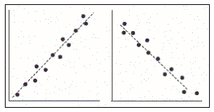
Correlation coefficient takes values like 0.9, 0.8, 0.75,-0.8,-0.9, -0.75 etc. Positive values in the series indicate “Strongly Positive Correlation” and negative values indicate “Strongly Negative Correlation”.
The scatter plot of the above scenario will look like this.
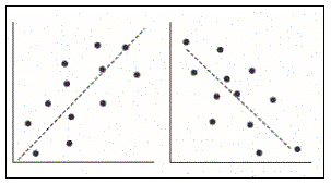
Similarly Correlation coefficient can take values like 0.4, 0.3, 0.25, -0.25, -0.3, -0.4 etc. Positive values in the series indicate “Weakly Positive Correlation” and negative values indicate “Weakly Negative Correlation”.
Below is the Scatter Plot that illustrates this. We can see how closely the data points are lying near the linear line (trend line can be used in excel) for data that are strongly correlated (positive or negative) as compared to the weakly correlated data points.
What will happen when two variables are not correlated at all?
They will behave randomly, and the plot will look something like the graph below. The r value will be ‘0’ when the variables are not correlated.
Correlation study is useful in many fields. Let us explore some of them here.
- It is used to forecast a ‘Y’ variable, given X and Y are correlated. Based on the historical values of X and Y, Y values for future can be predicted.
- In the field of medical research, researchers might want to know if a particular medical condition is related to intake/use of a particular medicine.
- In stock market, to understand how the rise and fall of share prices are related to changes in a particular economic parameter (say $ conversion rate/ FOREX rate etc.).
- In Process Improvement methodologies like Six Sigma, to assess the behavior of a particular metric and the influencing parameters, that cause the variation.
There are many such uses for Correlational Analysis. Users should remember an important point while performing Correlation Analysis.
Correlation does not always imply Causation
Correlation of X and Y variable does not mean that the variation in Y is caused by (or) due to a variation in X. It is just that they happen simultaneously. It is with the business knowledge, that the user should decide whether the relationship is causation or not.


