
Introduction to Outliers
Outlier is a value that lies in a data series on its extremes, which is either very small or large and thus can affect the overall observation made from the data series. Outliers are also termed as extremes because they lie on the either end of a data series. Outliers are usually treated as abnormal values that can affect the overall observation due to its very high or low extreme values and hence should be discarded from the data series.
An outlier can also be stated as a value that lies outside the overall pattern of a distribution and thus can affect the overall data series. Outliers is often regarded as the cause of an error in measurement due to presence of extreme values which may underestimate or overestimate a study because it lies at an abnormal distance from other values in a random sample from a population.
As per the basic standards followed by all statisticians a convenient definition of an outlier is a point which falls more than 1.5 times the interquartile range above the third quartile or below the first quartile. When performing least squares fitting to data, it is often best to discard outliers before computing the line of best fit since these points may greatly influence the result.
Box Plot Diagram
Box plot diagram also termed as Whisker’s plot is a graphical method typically depicted by quartiles and inter quartiles that helps in defining the upper limit and lower limit beyond which any data lying will be considered as outliers. The very purpose of this diagram is to identify outliers and discard it from the data series before making any further observation so that the conclusion made from the study gives more accurate results not influenced by any extremes or abnormal values.
Identifying Outliers
Let n be the number of data values in the data set.
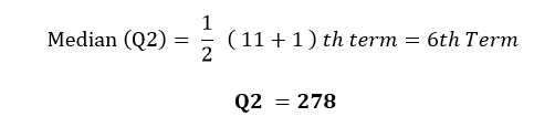
The Median (Q2) is the middle value of the data set.

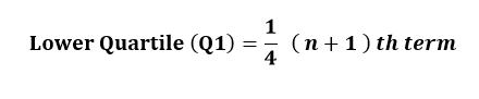
The Lower quartile (Q1) is the median of the lower half of the data set
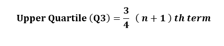
The Upper quartile (Q3) is the median of the upper half of the data set.
The Interquartile range (IQR) is the spread of the middle 50% of the data values.
Interquartile Range (IQR) = Upper Quartile (Q3) – Lower Quartile (Q1)
IQR = Q3 – Q1
Lower Limit = Q1 – 1.5 IQR.
Upper Limit = Q3 + 1.5 IQR
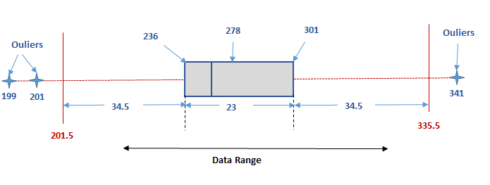
Figure 1 (Box Plot Diagram)
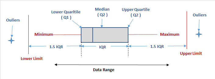
So any value that will be more than the upper limit or lesser than the lower limit will be the outliers. Only the data that lies within Lower and upper limit are statistically considered normal and thus can be used for further observation or study.
Example
Let the data range be 199, 201, 236, 269,271,278,283,291, 301, 303, and 341
Therefore n = 11
Conclusion
Hence it is clear that any range above 333.5 or below 201.5 are outliers. Hence in the data series 199, 201, 236, 269,271,278,283,291, 301, 303, 341, outliers are 199, 201 and 341. These 3 values which lies on either of the extremes can be considered abnormal and should be discarded from the entire series so that any analysis made on this series is not influenced by these extreme values. So the data series that should be considered for further observation or study after discarding the outliers are as below.
236, 269,271,278,283,291, 301, 303